Author: Natasha Cantwell
Communications & Public Programming Officer
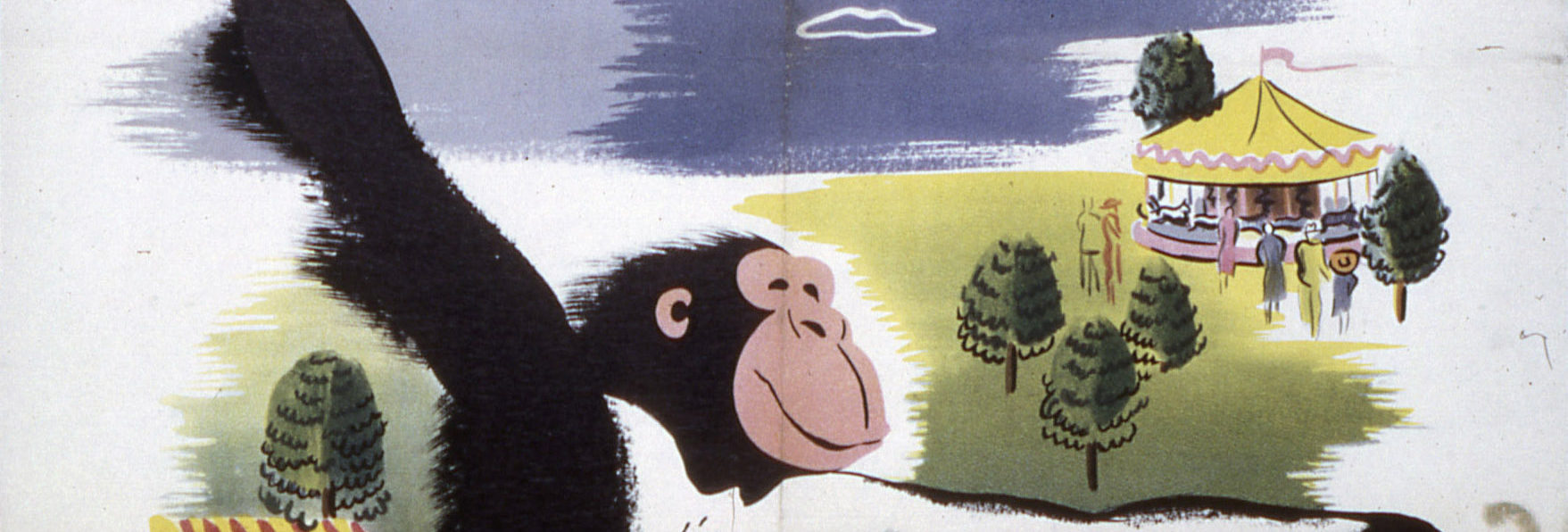
When you think of 1950s graphic design, what style comes to mind? This era is often described as Mid-Century Modern but captured under that umbrella term are some opposing trends. We've delved into PROV’s Public Transport Photo Collection to uncover Melbourne's mid-century posters that range from retro kitsch right through to the Swiss Style.
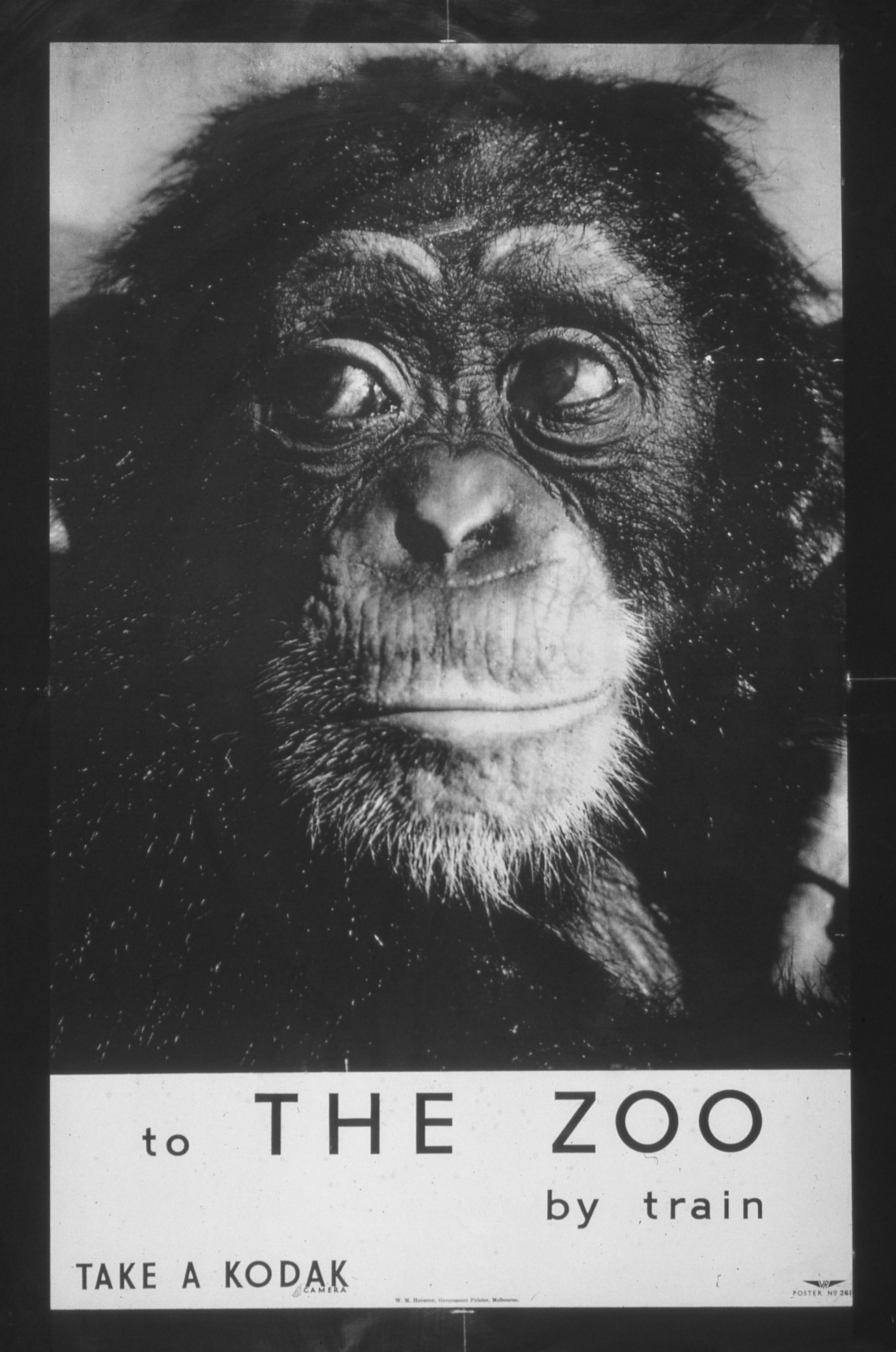
Led by Armin Hofmann at the Basel School of Design and Josef Müller-Brockmann at the Zurich School of Arts and Krafts, the Swiss Style (also known as the International Style) emphasised simplicity, legibility and objectivity. Drawing from early twentieth century art and design movements across Europe, including De Stijl, Bauhaus and Constructivism, the Swiss Style was bold and forward-looking. These designers often regarded illustrative drawings as being old-fashioned, preferring to incorporate photographs or typographic elements into their work.
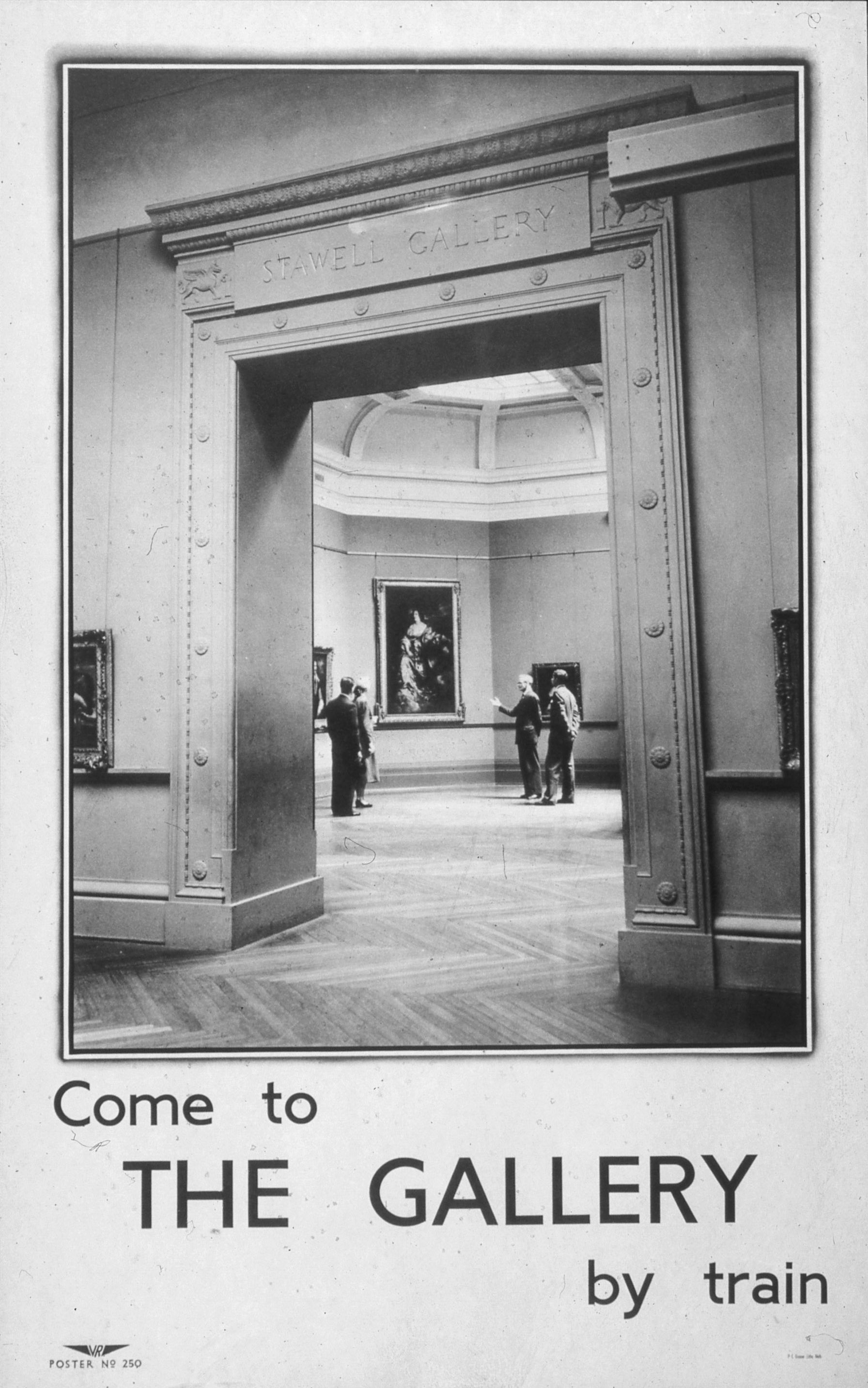
During the 1950s, Victorian Railways commissioned a series of wonderfully austere-looking posters to promote entertainment and leisure activities. Clearly inspired by the Swiss Style, they feature sombre black and white imagery, including a chimpanzee with a pensive look and an imposing gallery archway. Elegant and understated, these images could pass as movie stills from an Italian arthouse drama. With their clean layouts and easy to read sans-serif fonts, the posters are certainly functional and accessible. However, compared to what the mainstream public was used to seeing from travel and leisure posters, this series seems like a brave move from Victorian Railways and it would be interesting to know how the public reacted to them at the time.
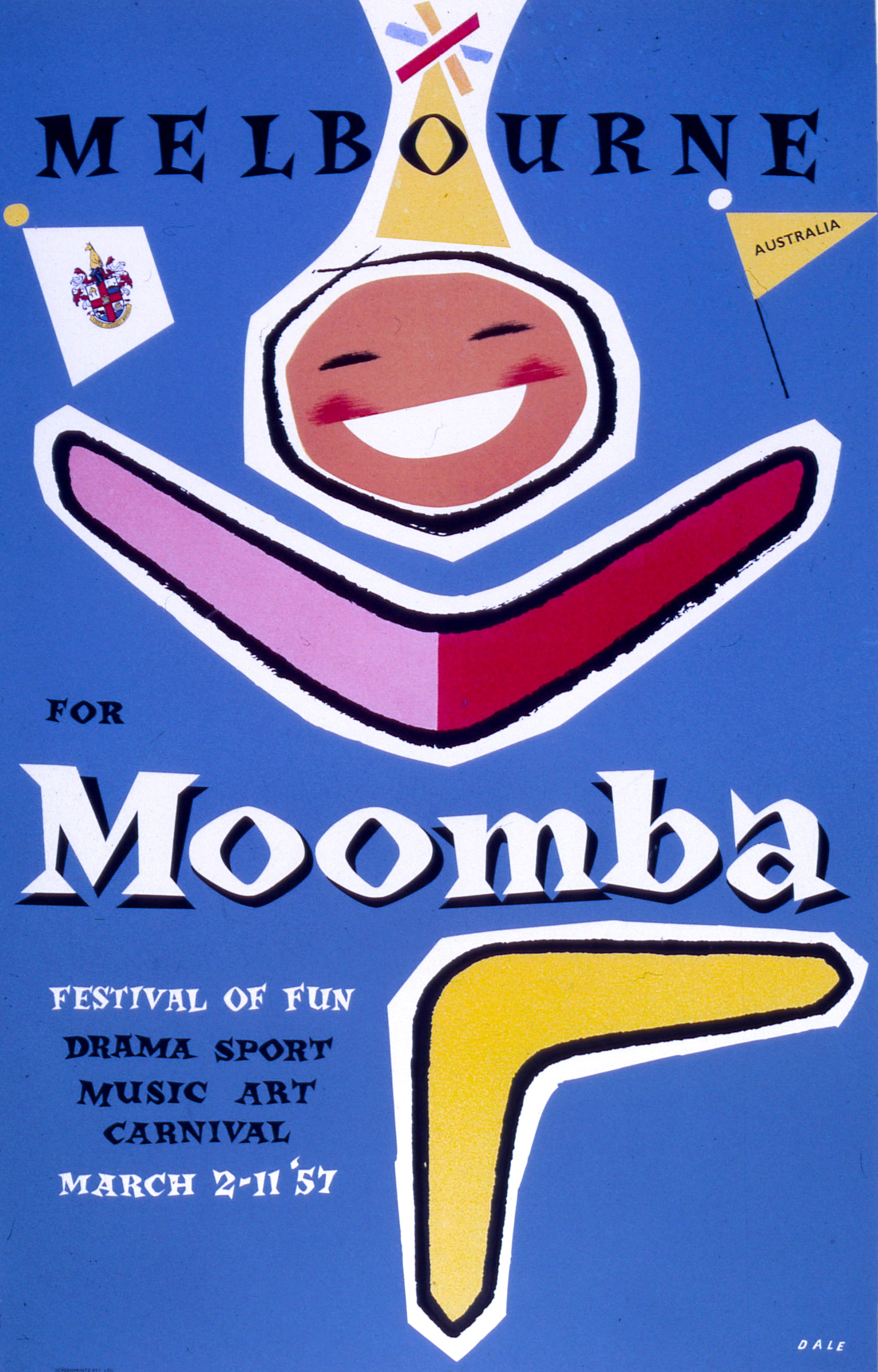
In contrast to the European-influenced style, another trend had emerged during this period that is now often simply described as 1950s Style. It featured colourful designs with almost cartoon-like illustrations and playful typefaces that had a hand-drawn appeal. The inspiration here came from the United States, in particular, graphic artists such as Alex Steinweiss, whose bright, whimsical designs represented a period of post-war opportunity and the American dream. His record cover art from the 1940s was hugely influential on what was to become a popular world-wide style in the following decade.
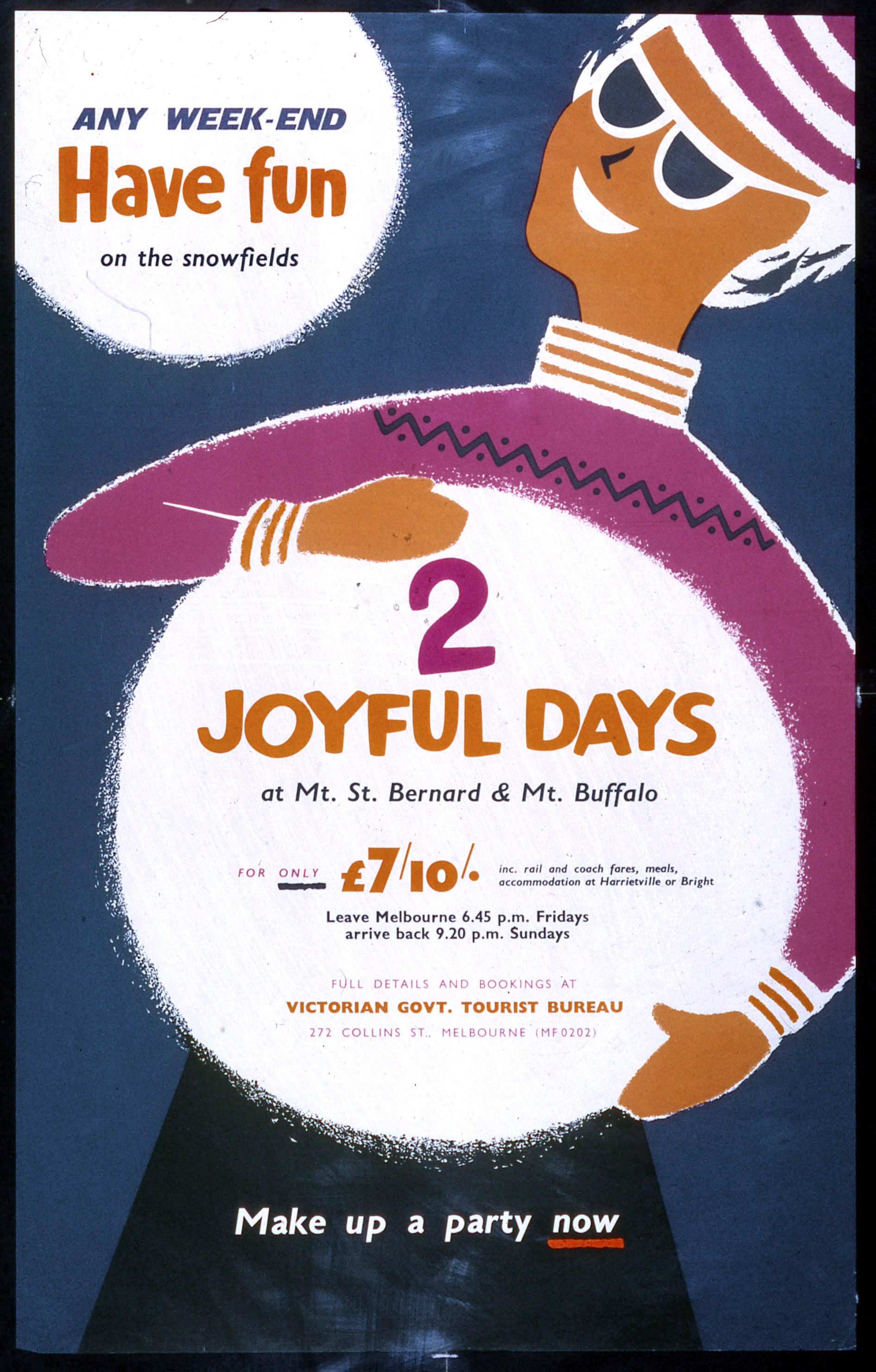
Whereas the Swiss Style endorsed objectivity, and letting the subject matter speak for itself, posters in the 1950s Style fully embraced the idea of promotion. Here we don’t just have ‘come to the gallery by train’ the copywriter has used adjectives like ‘fun’ and ‘joyful’. Jaunty layouts further suggest movement and excitement, and of course, big smiles are mandatory!
See our flickr album for more 20th century leisure posters from PROV’s Public Transport Photo Collection.
Material in the Public Record Office Victoria archival collection contains words and descriptions that reflect attitudes and government policies at different times which may be insensitive and upsetting
Aboriginal and Torres Strait Islander Peoples should be aware the collection and website may contain images, voices and names of deceased persons.
PROV provides advice to researchers wishing to access, publish or re-use records about Aboriginal Peoples
